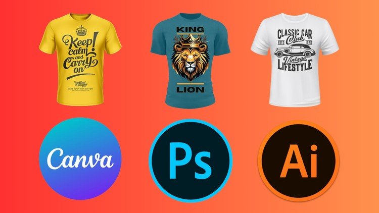


Learn UI Design in 5 weeks
Elevate Your Design Skills with our comprehensive course tailored for beginners and career switchers! Over 5 immersive weeks, delve into the heart of user interface design and learn to craft captivating landing pages, sleek apps, and intuitive dashboards from scratch. Embrace design principles and techniques sans the overwhelming focus on specific tools like Figma, Framer, or Photoshop, mastering the art of selecting color palettes, choosing font families, and leveraging mood boards to amplify your designs. Boost your efficiency with visual explorations, basic prototyping principles, and seamlessly transition your designs to developers with precision and clarity. While we harness the power of Figma, the industry’s current gold standard, our focus extends far beyond a single tool, empowering you to thrive with any design software you prefer. Upon completion, emerge equipped to refine your visual prowess, curate compelling portfolio projects, and confidently pursue Junior Designer roles. Ready to unleash your creative potential?
Enroll now and embark on a transformative design odyssey!
Full 5 Week Course Program
-
Intro to Figma and any design tool
-
Design Principles & UI Design
-
How to build your color palette and color styles
-
How to choose your fonts and how to build you text styles
-
8 pixel grid, responsive design breakpoints, and auto-layout
-
Mood boards, visual research, visual exploration
-
Intro to prototyping
-
Basic project handoff
What You Will NOT Learn
-
Master Figma
-
UX Research
-
How to be a Product Designer
-
Design Systems
-
1
 Introduction
This course is for everyone who doesn’t have a design background or is doing a career transition to design. Here you’ll learn about the introduction of user interface design. How to design a landing page, an app, a dashboard… you’ll learn the concepts to do it with whatever tool you feel more comfortable with.
The focus here is not mastering Figma, Framer or Photoshop. The focus of this course is to guide you on the principles of design, and the design techniques to create ready-to-use screens. We will use Figma because it is currently the industry standard, but everything you’ll learn here you can apply to any tool.
Throughout these 5 weeks you will learn and understand what are the design principles, how to choose a colour, how to select a font family, what are mood boards and how to use them, how to speed up your productivity with visual explorations, the basic principles of prototyping and how to handoff your designs to developers.
At the end of those 5 weeks you will you will be able to refine and keep exploring your visuals, you will be able to create projects to put on your portfolio and start applying to Jr. Designer roles.
You will design 5 screens of a mobile app where you will apply the course topics.
You can choose the subject of your app or one of the following:
Sneakers eCommerce: home page, search, search results, product page, checkout
Banking: dashboard, transfer money, pay a bill, apply to a new credit card, add a payee
Fitness: dashboard, workouts list, selected workout, progress, challenge a friend
Enjoy and have fun.
-
2
What's UI Design?
The definition of UI design stands for User Interface Design. Don’t get confused with UX Design or Product Design. UI Design is one part of the Product Design role. UX is the User Experience that combined with the UI makes you a Product Designer. The only thing they have in common is the focus on the user.
UI is focused on the aesthetic, the form, the look and feel, the visuals and what colours you use, the font family, the icons, animations, effects, etc, while the UX is focused on how things behave and work within an interface.
Design Tools
These days most designers and companies use Figma as their design tool but there are a few that still use Sketch. There’s Affinity Designer for iPad, Photoshop, and Illustrator. In the past, we had Invision Studio and Macromedia Fireworks. We also have no-code design tools like Framer (amazing by the way), Webflow and Wix. These last two require a little bit of html/CSS skills. All those mentioned tools use layers by default. The actual layering concept is where every new element is on top of the other. But, huge but here, we usually design the screens from top to bottom starting from the header or top bar, you name it.
This may confuse some people who are not familiar with design tools at the beginning but you will get there. I still don’t know why the software companies did not change that yet.
For this course, we’ll use Figma but we’ll not cover 100% of Figma. You can download or use it on the browser version. Feel free to choose. Create your account and send an email to me so I can add you to our Mentor Session Figma file where we’ll do our exercises. If you want to learn more about Figma, I recommend the YouTube videos:
-
3
Design Principles
Now, let’s start this course properly. Let’s talk about the very beginning of how to design any interface either digital or print. For us to have a harmonious interface we have to follow some rules and most importantly, how and when to break those rules. Those rules are the design principles. There are 12 of them, but you don’t have to use them all, all the time.
Balance
As the name says, it is how we create balance in the interface. It is how we determine if an interface is equal in elements to avoid being unbalanced.
Emphasis
Emphasis is used to focus the viewer’s attention on a certain part of a composition. You can achieve that by manipulating elements (like colour, shape and size) to make specific parts of a design stand out. For example, a call to action on a landing page. You could increase the text size and use colours that stand out from the background, emphasizing the button and making sure visitors can’t miss it.
Repetition
Again, as the name says, it refers to when an element is repeated in a screen or flow to create a pattern, a visual memory. A real-life example is the brands on an interface. Usually, we place them on the top-left corner of our screens. And the brand is there on every single screen, repeatedly. Or a colour scheme where you know right away that a certain colour is applied to every single button.
Movement
When we say movement, we - in this particular case - are not talking about animation or things bouncing around the interface. The movement principle refers to the path a viewer’s eyes take when they look at your composition. Is how we guide the user toward the information, and how we use shapes, colours, and patterns. But try to avoid getting the user distracted.
Proportion
This principle represents the relationship between two items, two elements on the screen. Proportion helps the visual hierarchy. A good example is the title and subtitle of a blog post. You expect that the title should be a bit bigger than the subtitle and a lot bigger than the body text.
White space (probably my favourite)
Every single space counts in your interface. We live in a world right now where the fold doesn’t exist anymore. We don’t need to squish everything to fit above the fold, in the first page scroll. Users now scroll, scan, and go back to focus. Keeping all spaces even helps the user to read, to scan, and helps the elements to breathe. We will talk about this a lot when we cover auto-layout.
Contrast
We have four ways to create contrast in an interface: shape, scale, colour, and layout. Especially colour contrasts to improve accessibility.
Hierarchy
Probably THE MOST IMPORTANT design principle. It is how you determine and organize the elements and information within your design. You rank them from the most important to the least important to make it easy for the users to digest your content.
Rhythm
You create rhythm in your interface by repeating elements like lines, shapes, colours, font sizes, and other elements. Whatever helps to create a flow.
Pattern
Same idea of repetition, you create patterns to help the balance of your interface. The best examples are colours and textures in backgrounds.
Variety
Although a bit lost in the last couple of years, it adds spice. It stops the layout from being boring, but you have to know how to create variety in your interface.
Unity
Last but not least, unity is the union of one or more principles to make your interface unique. With a well-balanced, aligned, proportional interface, you will have a unit. Examples are grids, lists, blocks of content, and a photo gallery.
-
4
Let's Practice
Let’s practice on Figma what we learned so far about Design Principles starting with a wireframe for our project. Yes, I'll also do a project during the course duration so you can see how I work, how's my design process, how do I organize my files, and how I polish my UIs.
Speaking about projects, have you choose yours already? Yes? Great. No? No problem, here is the list of subjects for you to remember and choose:
Sneakers eCommerce: home page, search, search results, product page, checkout
Banking: dashboard, transfer money, pay a bill, apply to a new credit card, add a payee
Fitness: dashboard, workouts list, selected workout, progress, challenge a friend
And if you did not copy my file template, here is the link to do it.
-
5
Review of Week 01
Let’s do a quick review of what we’ve learned on Week 01:
We learned about the differences between UX and UI Design and how they work together in the product design role
We get familiar with design tools in general
We covered the 12 Design Principles: balance, emphasis, repetition, movement, proportion, white space, contrast, hierarchy, rhythm, pattern, variety, and unity.
Now, we will start to apply those to our interfaces. By the way, have you chosen the topic of your project? Nice. Let’s see what you’ll bring to the table.
I always like to differentiate this step into two when I work with my clients when I’m their first-ever designer: brand guidelines or not. And why is that? Because the brand guidelines can guide us on the next steps which are finding the right colours and following the font family. If you don’t have the brand guidelines what should you do then?
Well, create them. How? Let’s find out.
-
6
Colors
I always like to differentiate this step into two when I work with my clients when I’m their first-ever designer: brand guidelines or not. And why is that? Because the brand guidelines can guide us on the next steps which are finding the right colours and following the font family. If you don’t have the brand guidelines what should you do then?
Well, create them. How? Let’s find out.
First, let’s talk about colours.
Colours are important because they will impact your audience. For good…. or for bad. You have to understand how to select and combine colours, how many colours to choose and how to choose them. We have two color systems: CMYK and RGB. CMYK is Cyan, Magenta, Yellow, and Black and they’re mostly used for print work. RGB stand for Red, Green, and Blue, and that’s the system we use in the digital environment.
Each color have values from 0 to 155 where 0 is the absence of that color and 155 is the highest light. So if you have 0 for Red, 0 Green and 0 Blue, you have black. If you have 155 for Red, 155 Green, and 155 Blue, you have white.
To reproduce the RGB scale, we use hexadecimals. For example #000000 or #00ff00. And that’s usually how we set the colours on Design Tools. But don’t worry, I’ll show how to create a colour palette using Tailwind CSS colour generator.
We also need to understand about hue, saturation, and value of the colours to learn how to combine them in a colour palette.
Hue is the attribute of the colour: red, blue, yellow, green, etc.
Value is the relative lightness or darkness or greyscale of a colour. It helps to create depth and contrast
Saturation is the intensity, the purity of the colour
Colours also represent the feelings of people. For example, the colour green means that something is okay and fine. It also means going in a traffic light. On the other hand, red means stop, or danger, hot, and warmth. Blue represents cold, calm, and fresh. So on and so forth. You can do more research about colours later. It is a massive topic.
Now that we have a more understanding about colours, let’s build our very first colour palette. And to help us with that we have this amazing website called Tailwind CSS. Let’s jump right onto it. Tailwind CSS is a very common framework for front-end development nowadays and the people behind it designed this colour generator to help product teams to establish a standardized process between design and development.
It is super simple to use. You choose your primary colour and the site generates all the variants of that colour. Like that. (choose one).
A colour palette usually starts with the 100 value of the colour, which is the lightest and goes up to 900 as the darkest value. My recommendation is to use 5 values. In this case, the 500 or 600 will be your default colour and then you will have 2 light values and 2 dark values of each colour. That also helps the developers create the css values on code.
You can check in some UI examples how the colour behaves, you can check the contrast grid, and export the css code, and the best part is that they have a Figma plugin to help even more our process.
After you save the plugin, open Figma, hit command+I on your keyboard (or ctrl+I if you’re using Windows) and load the Tailwind CSS Color Generator plugin. Now is where the magic starts. You simply have to copy and paste the HEX value to the plugin and click on “Generate styles” and voila. Now you have all the styles quickly added to your Figma file.
And now you might be asking: what the heck are styles? GREAT question. Styles are a feature for you to apply a colour to any element in a very easy way. And with that, whatever elements have that style applied, if you need to change it, you change the style and everything gets updated on the fly. It is that simple.
So before you create the elements, components, shapes, and frames, create your colour styles. -
7
Typography
Now let’s talk about Typography
In the same way, colours are huge, and the choice of your font family is also important. And the approach I take about the brand guidelines with my clients works for typography as well. The brand guidelines should dictate what font families and variations we use. Usually, no more than 2, or 3 if it’s REALLY NECESSARY!!!
When we talk about fonts, we have serif and sans serif. Serif is that tiny “tail” (for the lack of a better word) that some letters have. Therefore, if you choose a serif font for a long sentence or paragraph and the size of the font is not good enough, the readability will be compromised.
Speaking of which, readability is the most important thing to pay attention to when selecting our fonts. Details that matter in this case:
Font size
Font Weight: bold, regular, light
Font style: italic, normal, underline
Font colour: if the value of your colour is too light, it can be very hard to read due to the low contrast with the background for example
The best way to select a font family is using Google Fonts with lots of fonts for free that you can choose. Play around, type a text related to your project to see in real-time how the font behaves, download, install and open Figma.
And the same way we have color styles, on Figma we can create text styles. The principle is the same. Be easy and quick to transform and text in your interface, maintain consistency, and avoid mistakes. The best way to approach this is to connect with a developer from your team to create the styles reflecting the css styles and html tags: H1, H2, H3, body or paragraph, links, error messages, hints, subtitles, titles, and so on.
Let’s open Figma again and see how it is to create the text styles.
On Figma, you can type a text, format the way you like, and click on the waffle icon. Then, click on the plus icon and add the name of the style. To apply the text style select the other text that should be the same style and select the correct one. Boom. All properties applied.
-
8
Mood board & Visual Exploration
Now that you worked and created your styles on Figma, is time to go back to the browser and do some research. The most common technique we use in real life, working with clients and teams, is the mood board.
Mood boards are also known as visual research or visual reference. This is where you’ll have everything to inspire your creativity during the visual design process. But keep in mind that you should not only look for competitors or apps similar to yours. Go above and beyond that. Anything can light a sparkle in you.The most common tools or places to build your mood board are: Dribbble, Pinterest, Behance, Unsplash for free, and (my favorite) Mobbin, paid. Back in the day, I used to go to newsstands and buy surf, fashion, and architecture magazines, cut and paste them into cardboard and have them hung around the office to help.
What I usually like to do is create a separate page on my Figma file just to paste all my inspirations. That way I keep everything centralized in one place, the file is well organized and it is easy to share with everyone in the team.
It is also important to address, that there’s no particular order here in this process. You can create your mood board or boards, before or after your styles. Based on your project’s priorities or necessities, you will be able to determine what order you’d work. Whether you already have the brand established or not, or if you are jumping into a project that already has a design system and you need to design a new feature, so on and so forth.
After that, you can start exploring your designs based on the references you’ve found, the style you are looking for in your project, and the visual identity of your brand. I learned from a past manager and mentor, that without at least 10 different approaches of the same screen, we don’t have enough to narrow down our decisions. I couldn’t agree more. But since you’re starting, try to go with at least 5 screens even if the variation from one to another is small. At least you’ll be trying different styles for your designs.
There you have it, now you know how to choose your colours and typography, how to build your colour palette and how to create your styles. Now it’s time to practice on your project.
-
9
Let's Practice
Let’s practice on Figma what we learned so far about Design Principles, color styles, font styles, and having our mood boards open to use as reference. Let's add our vision to our projects. Most of all, have fun in the process!!!
-
10
Review of Week 02
Let’s do a quick review of what we’ve learned on Week 02:
We talked about the importance of styles and colour pallets, and how to create them
Mood boards & visual research
This week, our main focus is creating our very first design screen using everything we have from weeks 1 & 2: design principles and our styles. To do that we’re going to talk about information architecture and information hierarchy, the 8-pixel grid and breakpoints.
-
11
Visual Explorations
Now that you have at least 5-10 screens explored with styles, elements, different ways of structuring your content, and all, it is time to reflect on those explorations and start to design the “final” screens. And why I’m using final in between quotes? Because the screens are never finalized. You always have to test, gather feedback from the users, from your audience and get back to the designs to fix whatever is needed. But to minimize the “mistakes” or wrong assumptions you may have, there are some techniques you can use.
-
12
Information Architecture
Information architecture (IA) focuses on organizing, structuring, and labelling content effectively and sustainably. The goal is to help users find information and complete tasks. To do this, you need to understand how the pieces fit together to create the larger picture, and how items relate to each other within the screen. You need to organize your content focusing on what is the primary actions for the user, and in a way to guide the user to find the right information.
It is not easy, but this is a step often mistaken or forgotten. Do you recall any app that has elements all over the place, or that was hard for you to understand how to use or where to start looking for something? Yep. That’s the lack of information architecture.
An easy way to start practicing IA is to create boxes of your content and list them in order of priority or importance within your subject. For example, if your product is a travel booking app, what is more important: the search bar or the featured place? What’s the user’s priority when opening your app: create an account or find a place and only create the account on the booking process?
The most common exercise and user test you can do to figure out your information architecture is card sorting. There are plenty of other exercises you can do, but card sorting is easy, quick and efficient. You simply grab a Post-it notepad and write your content. One per post-it. Now you can spread around the table and try to organize the post-its accordingly. You can use FigJam for that too. It’s even better with the team to help.
Now it is your time to practice this with your project and see where it leads.
-
13
Visual Hierarchy
Following the same logic of the information architecture, we have the visual hierarchy. And this is also often mistaken or forgotten. As the name implies, this step of the design process is to add all visual clues to your audience. It is not only important for the aesthetic of your screen but for accessibility as well. It helps people with impaired vision lack of contrast or color blindness.
How do you differentiate a title from a subtitle? A primary button from a secondary button? Different font sizes? Font weight? Filling or stroke on the buttons? Remember that not always colour difference will help.
Try a couple of different styles in your elements, and see how they reflect and change your design. Show to other people and ask them to choose what is better for them in terms of readability. Gather some answers and get back to your design tool to work things around.
-
14
8px Grid
Now that you’re able to structure your designs, it’s time to understand how to organize everything on the screen and make everything fall into the right place. And the best way to do it is by using simple math. Remember during week 1 when we talked about pattern, unity, and balance as design principles? Well, to help us achieve those, there’s something called paddings and margins. Margins are the borders of the screen and of the elements, while padding is the space in between them.
By using math, always choose a multiple of 8 to get the optimal alignments and spacing. That’s what we call the 8pix grid. In this case, if a button follows the 8px grid rule, it will have a padding of 8, 16, 24, 32, and so forth. The font size inside that button will be 16, 24, 32…
Of course, every rule is meant to be broken, but you have to be extremely careful when and how to break that rule. Always take accessibility issues into account when breaking the 8px grid rule, ok?
Another example is a list of input forms. To keep unity to the form, all inputs should be 8, 16, and 24px from each other. You also have to consider the padding between the title of the form to the first input.
Now imagine a blog post where you have a hero image, title, subtitle, 4 paragraphs, and tags. How do you structure that using the 8px grid?
Maybe you have 32px from the hero image to the title, then 16 from the title to the subtitle, then 32 from the subtitle to the paragraphs, and 32 from the paragraphs to the tags. That way you’ll have all the elements evenly spaced using 32px and the title and subtitle grouped as one unit with 16px of padding.
If you follow that, for sure your life and the lives of your design peers will be much more easy.
-
15
Breakpoints
Now that you know and tried the 8px grid, it’s time for the last piece of the structure puzzle: BREAKPOINTS.
Breakpoints are how we organize our screens to be responsive. To work in any environment, from mobile to tablet, to desktop, to TV even. Tools like Framer, for example, start with the desktop being the primary breakpoint and then it auto-adds the tablet and mobile. Everything you do on the primary breakpoint is reflected and auto-updated on the others. I just with Figma had something like that too.
On Figma, we need to work a little bit harder to do it using auto-layouts, which we’ll cover next week. But right now you just need to understand that for a design to be responsive, it needs to behave and fit into multiple screen sizes. Sometimes a grid becomes a list or vice versa. Other times a stack of elements needs to be adjusted and using the 8px grid rule, everything gets a lot easier.
-
16
Let's Practice
Let’s practice on Figma what we learned so far about breakpoint and how it can help us with our projects.
-
17
Review of Week 03
Let’s do a quick review of what we’ve learned on Week 03:
We learned about Information Architecture and Visual Hierarchy and why those are super important for your layouts.
We covered the 8-pixel grid rule, how to align and space elements across your screen, and why this is super beneficial for your projects
Last but not least, we talked about breakpoints and how to build responsive layouts
All of those items from last week’s learning will come in handy in this week’s topic: Auto-layout. So, go to your next lesson and let’s dive in.
-
18
Auto-layout
Auto-layout is one the most important things you need to learn to proper design your projects. It helps with consistency, with alignment, with structure, and more.
It is best used for:
Lists
Grids
Cards
Tables
Inputs
Buttons
Forms
But keep in mind that you need to understand when, why and how to use it to avoid over using it.
-
19
Let's Practice
Let's practice what we've learned about auto-layout using Figma.